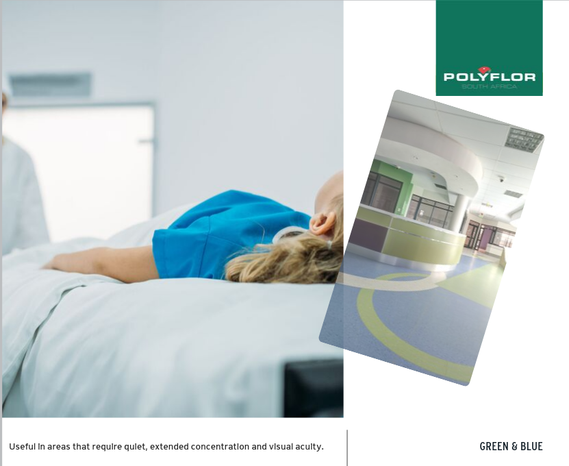
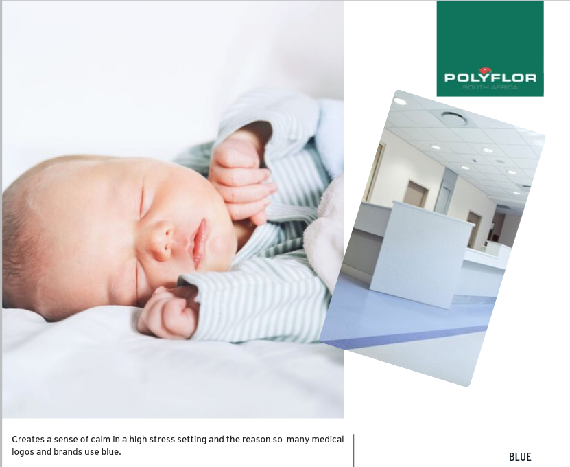
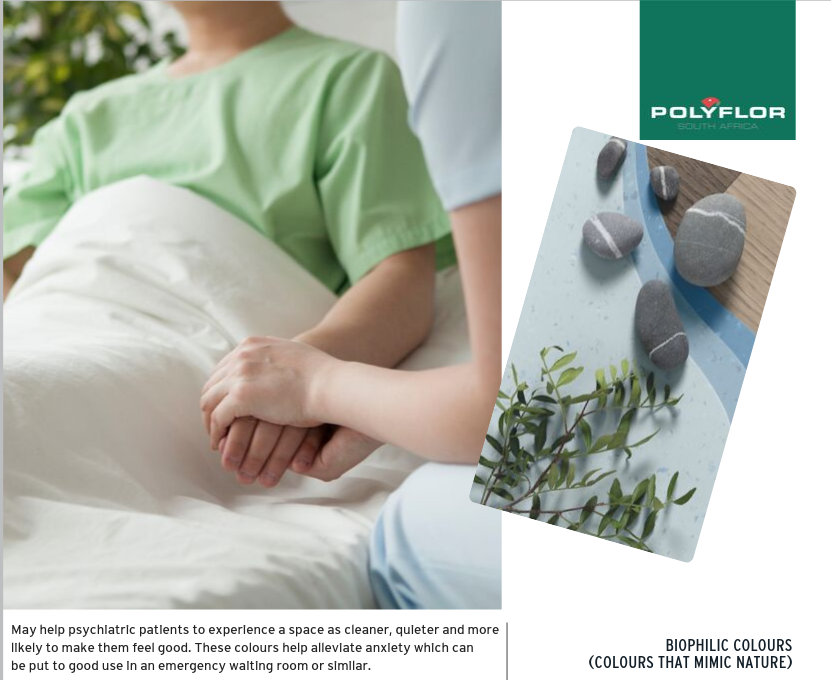
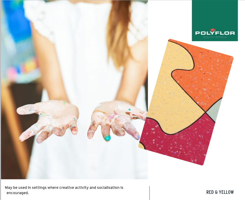
Inspired Design

Colour Feels

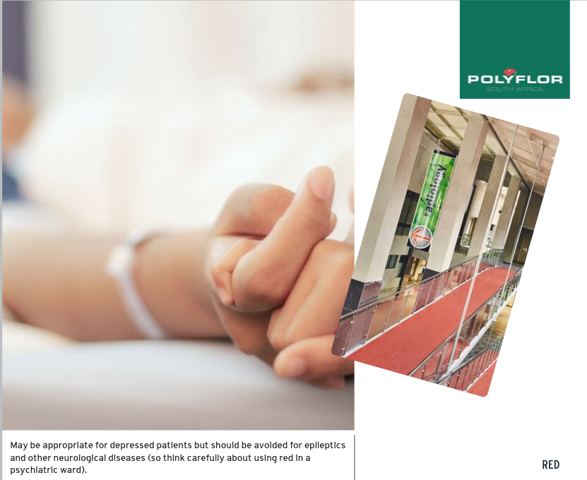
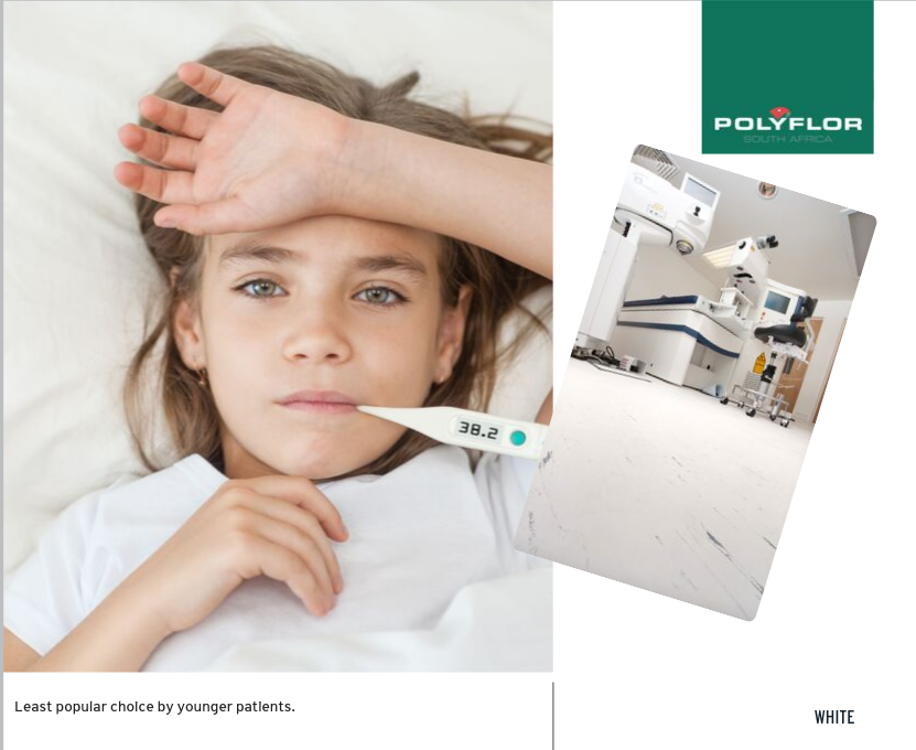
Colour can have an effect on long term patients and it is important to think about the setting and circumstances of your patients. Research shows that blues and greens are most preferred by young children, while and busy, colourful patterns should be avoided in neurological settings


The next insight in our “Colour in Healthcare” series demonstrates research from a study on a group of extended-stay patients and their perception of colours.

Young patients prefer healthcare facilities in mid-range blues and greens

Warm blues, pastel green and mid yellow and orange are the most preferred colours for hospitals

Green and blue is useful for healthcare facilities that require quiet and concentration

Blue creates a sense of calm in high stress settings

Colours that mimic nature help alleviate anxiety and are often put to use in emergency waiting rooms

Red and yellow encourage creativity and socialization

Red should be avoided for epileptics and other neurological diseases but is appropriate for patients with depression

White is the least favourite colour for younger patients


Did you miss our last post in the Colour in Healthcare series? Find out more about the how colour can influence a healthcare space.

Find out more about colour in healthcare


Sign up for Polyflor Insights and get our latest articles and insights delivered straight to your inbox.

Subscribe to Insights


Similar posts

Get insights and trade secrets from our team of experts, straight to your inbox.

We would love to share our knowledge that we’ve gained from many collective years of experience within our team.