If we look carefully around us, our natural world is wonderfully made up of concealed textures and materials that create beautiful displays of colours and shades. It is a world of light reflecting colour of every tone and hue we can possibly imagine.
.jpg?width=600&name=9%20(1).jpg)
Colour was the defining inspiration for Palettone
For over 4 years Polyflor has been delving into the psychology, philosophy and trends of colour in every aspect of our world.
Colours are being embraced in new and different ways throughout the environments in which we live, work and play. The psychology of colour is being studied in order to determine the effects of colour and how to use them, which colours stimulate thinking and concentration, which are soothing and restful and if colours help inspire thinking or create a feeling of wellbeing.
There is no doubt that colours have seasons and that colour trends are no longer only set by the fashion industry. Vehicle manufacturers are very often leaders in setting new colour trends and are often quite adventurous in their choices. There has been a shift from using colour from purely an aesthetics point of view towards incorporating colour into the actual product design.There is a science to this which adds so much depth to a product.
- Modern buildings contain more colour and we have seen lots of neutral greys and beiges with blues adding a fresh airy feel in commercial environments along with concrete and stone.
- Pinks and purples have made a strong comeback in fashion, cosmetics and interiors.
- Greens have been identified as stimulating learning and concentration and have set a trend in office and education environments creating an atmosphere conducive to learning.
Biophilic design
On this journey to gain a deeper understanding, we discovered biophilic design which prescribes an innovative way of designing the places where we live, work, and learn. Biophilia is defined as the inherent human inclination to affiliate with and appreciate nature. The moral imperative of biophilia is that we cannot flourish as individuals or as a species without a compassionate and considerate relationship to the world beyond ourselves of which we are a part. The blockbuster movie Avatar portrayed a lovely example of a biophilic relationship. Biophilic design, an extension of biophilia, incorporates natural materials, natural light, vegetation, nature views, nature colours and other experiences of the natural world into the modern built environment.
The recent trend in green architecture has decreased the environmental impact of the built environment, but it has accomplished little in the way of reconnecting us to the natural world - the missing piece in the puzzle of sustainable development. Biophilic design creates buildings that connect people and nature - hospitals where patients heal faster, schools where children’s test scores are higher, offices where workers are more productive, and communities where neighbours and families thrive. Biophilic Design points the way toward creating healthy and productive habitats.
In choosing colours for Palettone it was imperative that we placed a focus on colours that stem from nature. We looked at how light airy colours and strong fresh colours appear in nature. How light sometimes beams brightness into a colour and shadows grey them out. We started with 200 colours and taking all our research into account, we settled on 7 colour palettes comprising a total of 50 colours.
When thinking about biophilic design the palettes were important - each palette drawing from different aspects of nature and colour to inspire design. To offer you a base from which to create a space to connect people with nature.
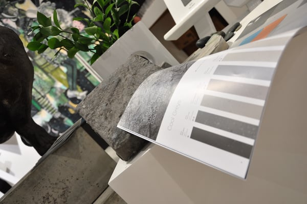
We have cool greys drawing their inspiration from stone surfaces blending easily with concrete trends.Starting with light airy colours such as Urban Air then adding browns and blacks to create deep earthy colours.
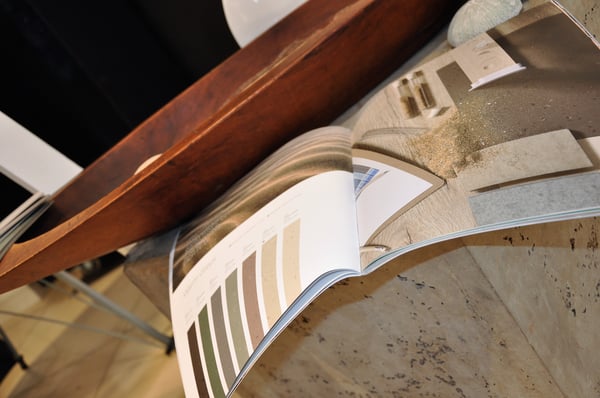
Warm greys reflect the lights and darks, shadows and highlights of windswept sands. Strong warm airy neutrals with added tones of greys, greens and browns that nature would reflect on warm sands.
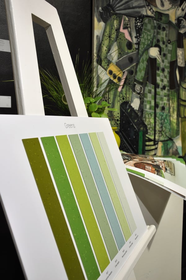
Green is probably one of the most prevalent colours in nature and key in bringing nature into our design world, whilst also affording the benefit of stimulating learning and concentration. We have colours like Penny Royal Mint which merge greens and blues like the sea and Festival Field a greyed-out green that reflects a well-trodden pasture after a music festival. These grey greens when combined with brighter colours really make them sing. The green palette conjures up thoughts of crisp apples and grass in the rain, English gardens and sunny meadows.
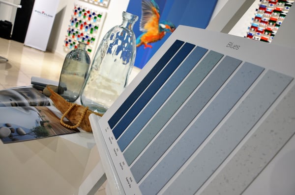
Our blue palette breathes of fresh air and cool waters following the trend of removing some colour to create greyer tones and adding greens reminiscent of the sea. There is a feeling of first morning light to deep ocean seas, peace and tranquillity.
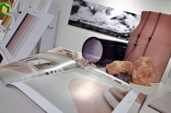
On-trend colours pink and purple were inspired by natural crystals. This palette offers very soft feminine pinks to regal strong purples, rose quartz to potassium permanganate – fresh blossoms to deep pansies – neutral to vibrant.
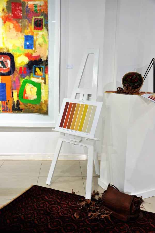
We can’t exclude yellows and reds in nature. These are our emotive colours and the colours we use to evoke fun. Primed Canvas offers a gentle fresh introduction to the palette and the essence of yellow, followed by brighter yellows and oranges inspired by sunshine and autumn leaves. Heritage Hall is a deep blue red invoking thoughts of roses and heritage, history, persian carpets, tapestry and leather.
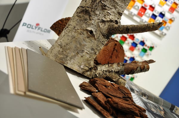
Trees and bark in their many different forms have inspired the beige browns. Lots of neutrals with warmth are a definite trend in countries with warmer climates. A light to dark palette with yellow tinges end with some greying hues to include all-natural bark inspired colours.
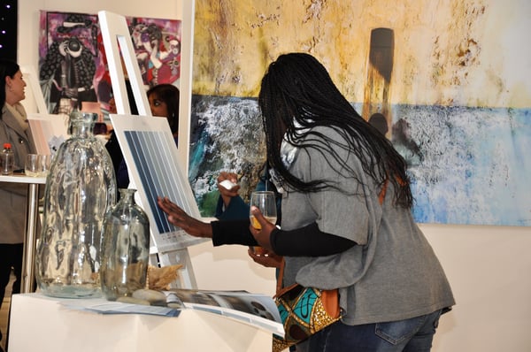
In all palettes we have started with air colours, fresh light neutrals, early mornings and just hints of colour. These neutral starting points allow you to incorporate other colours from the range to create a custom palette. Whether you use the predefined palettes or create your own there are colours that blend, contrast and create a natural and inspiring floor to form the base of your design for any space.
Palettone brings with it a world of other benefits.
- The solid base colour is enhanced with a lighter and darker contrast colour.
- In some colours this is more obvious than others and there is a science to this which relates not only to making up the colour but also showing less dirt or scratches by this complementary blend of colours.
- The range is suitable for use in any area of design from healthcare to education, retail to commercial and also available in a static dissipative sheet and 608 x 608 tiles to assist you in creating a universal palette. Palettone has a matte surface with a PUR coating for easy maintenance, low VOCs and carries an unprecedented 15-year warranty.
For colour, for choice, think Palettone.
Choosing vinyl flooring offers a wide variety of styles and colours for your premises. Here's some helpful design inspiration to get you thinking.